3 Tips for Improved Readability: Are People Actually Reading Your Content?
As a content creator, there’s nothing more frustrating than pouring your time, blood, sweat and tears into a blog that no one reads. It’s well established that people rarely read online. Instead, they scan copy quickly to parse out just what they need.
So how can we help users find the information they’re looking for quickly? Here are some tips to improve readability and comprehension on your site.
What Is Website Readability and Why Is it Important?
People are busy. Having a website that’s easy to read is a natural extension of designing a website that’s easy to navigate. Your hurried users aren’t going to have time to read through large blocks of text and that isn’t new. Testing has established that users tend to scan text and find exactly what they need, and that behavior hasn’t changed in the 23 years it’s been studied.
Understanding Readability Online
Readability basically breaks down to how easily someone can understand the text you put on a page. There are two main factors that affect your readability: the complexity of your topic, and the audience that’s reading it.
Keep it simple. No matter how complex the topic of your blog is avoid technical terms that most people won’t understand. Knowing your audience can help ensure you’re writing at their level, not over their heads.
1. Omit needless words.
Strunk & White’s Rule #17 (circa 1920): Omit needless words. It’s Composition 101, but it works. Readers expect us to get to the point. That irks our prosy, creative selves, but always remember who you’re writing for.
The fewer words in a sentence, the better your readability score. Here are some things to keep in mind when editing your content:
- Remove unnecessary adjectives and adverbs.
- Keep your sentences short, around 13 to 19 words.
- Keep your paragraphs short. Two to three sentences is the sweet spot.
2. Use scannable formatting.
Purposefully apply a web content format that encourages scanning.
This means you should use one or a combination of the following:
- Concise, relevant titles (for both the main title and any heading)
- Headings to differentiate each section (see above)
- Bullets to break up long lists (like this one)
- Graphs to convey data (people love data visualization)
- Bold or italics, where appropriate, to add emphasis on key ideas
- Images (we all like pretty pictures)
Thinking about what makes a website easier to read on different devices can also help. Be sure to consider the user experience on desktop, mobile phones and tablets. Subtle design changes can improve the readability of your content.
Related: The Ultimate Glossary of Content Marketing Terms

3. Keep white space contrast high.
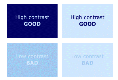
The simple rule: high contrast is good; low contrast is bad. (There is an incredibly detailed and in-depth article from W3C that describes this in more detail, but that’s the gist). High contrast colors, like black and white, makes text easier to read which is why few websites use other colors for bodies of copy.
You can see the benefits of contrasting colors in this picture:
There are more ways to improve readability online. Start with these tips and monitor engagement; you should see a noticeable uptick in session duration time. We can help make additional improvements with our Accessible Design and Development services.
Ready To Take on The World?
Digital marketing success is measured in marginal improvements like website readability. Working with a professional agency like Oneupweb can help identify opportunities to make small changes that offer valuable results. See what more than two decades of experience can do for your brand; contact us or call 231-922-9977 to get started.