Inspecting Web Design on Global Accessibility Awareness Day
Roughly 15 percent of the population is overlooked during the process of building websites and producing digital content. For the people being overlooked – those with visual impairment, mobility impairment and other special needs – the internet isn’t a very friendly or inclusive place.
Before we celebrate Global Accessibility Awareness Day with examples of awesomeweb design, watch this video to see what it’s like to navigate the internet with a disability.
At Oneupweb, we build accessible websites and design accessible digital assets for our clients. Let’s talk about why and how to prioritize website accessibility in everything you design and develop.
What Is Global Accessibility Awareness Day?
Global Accessibility Awareness Day is a day for building awareness of accessibility on the web and educating people about being inclusive when creating a website, app, video, graphic and more. It is celebrated each year on the third Thursday of May.
Why Is Website Accessibility Important?
Website accessibility is important because it gives everyone an equal opportunity to use the internet. Because so much business, entertainment and education occurs online, it’s important for everyone to be included and able to participate in society as they desire.
Besides making the internet a better place for all humanity, here are other reasons website accessibility is important:
- Website accessibility is required by law, in some cases. Regardless of current legislation, your business can be sued for having an inaccessible website or app.
- Building a website with accessibility first provides a better user experience. If you have a business, this leaves a good impression on customers and creates more potential for new business.
- Good website accessibility improves SEO, or your site’s perceived authority within search engine algorithms. If you want to show up higher in Google search results, this is your chance.
“Accessibility can enhance your brand, drive innovation, and extend your market reach.”
World Wide Web Consortium
It can be easy to dismiss website accessibility as a non-issue, especially if you believe that people with disabilities aren’t interacting with your website very often. But Global Accessibility Awareness Day is the perfect day to shine a light on all the ways you can improve your website and content by putting accessibility first.
How Oneupweb Approaches Website Accessibility
Our marketing agency is all for website accessibility – otherwise, we wouldn’t be celebrating Global Accessibility Awareness Day! We keep accessibility top-of-mind for our design and development services, checking color contrast, hover states and other accessibility details. The websites we build are WCAG AA compliant.
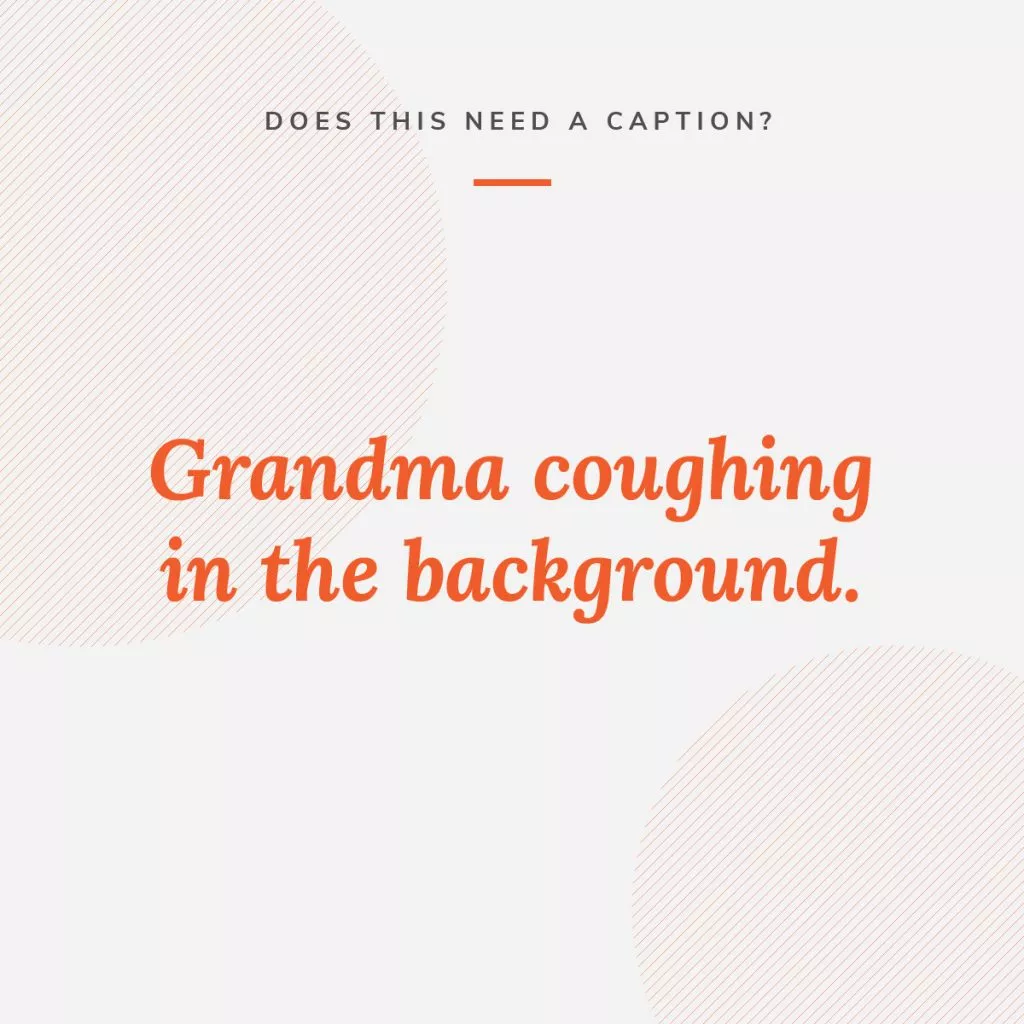
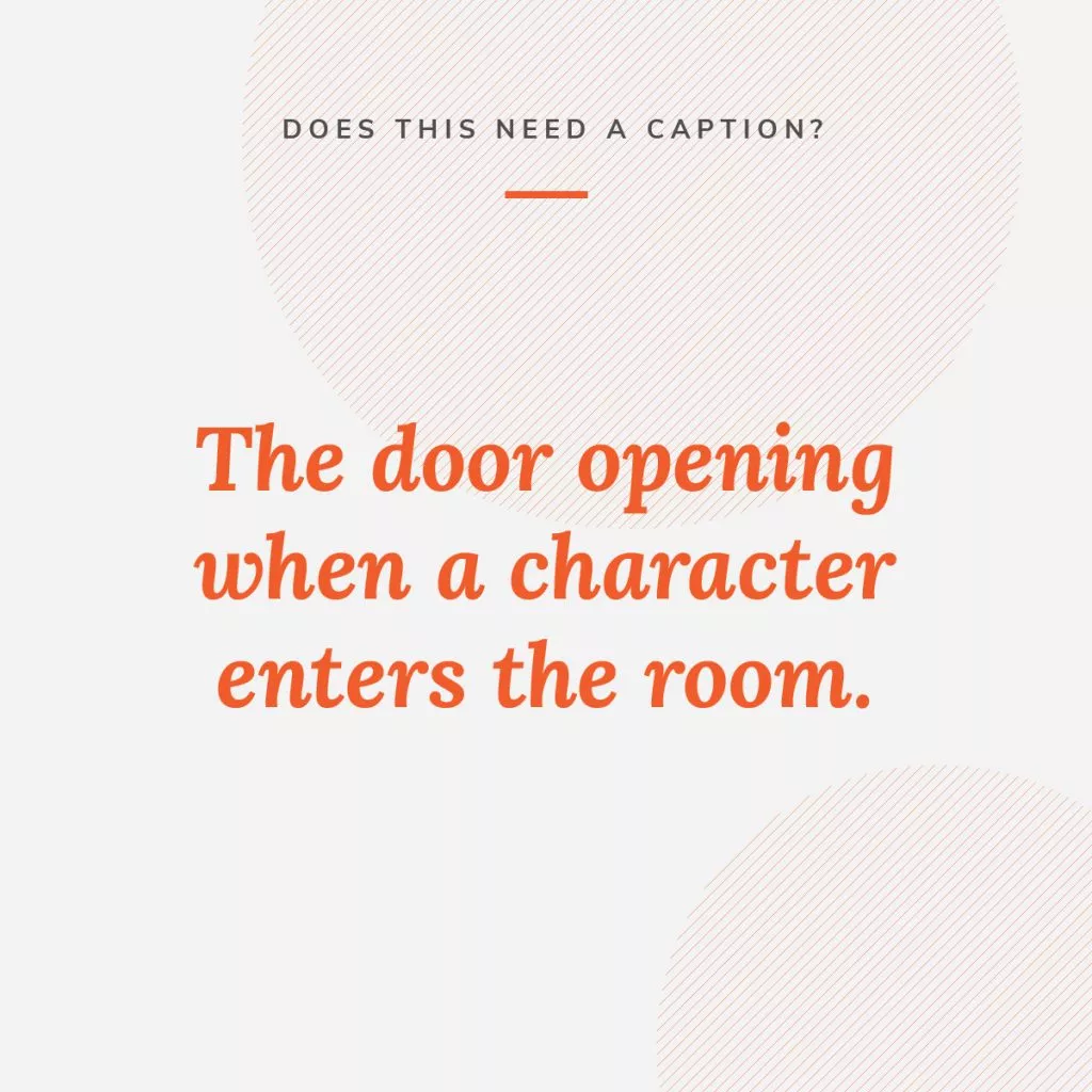
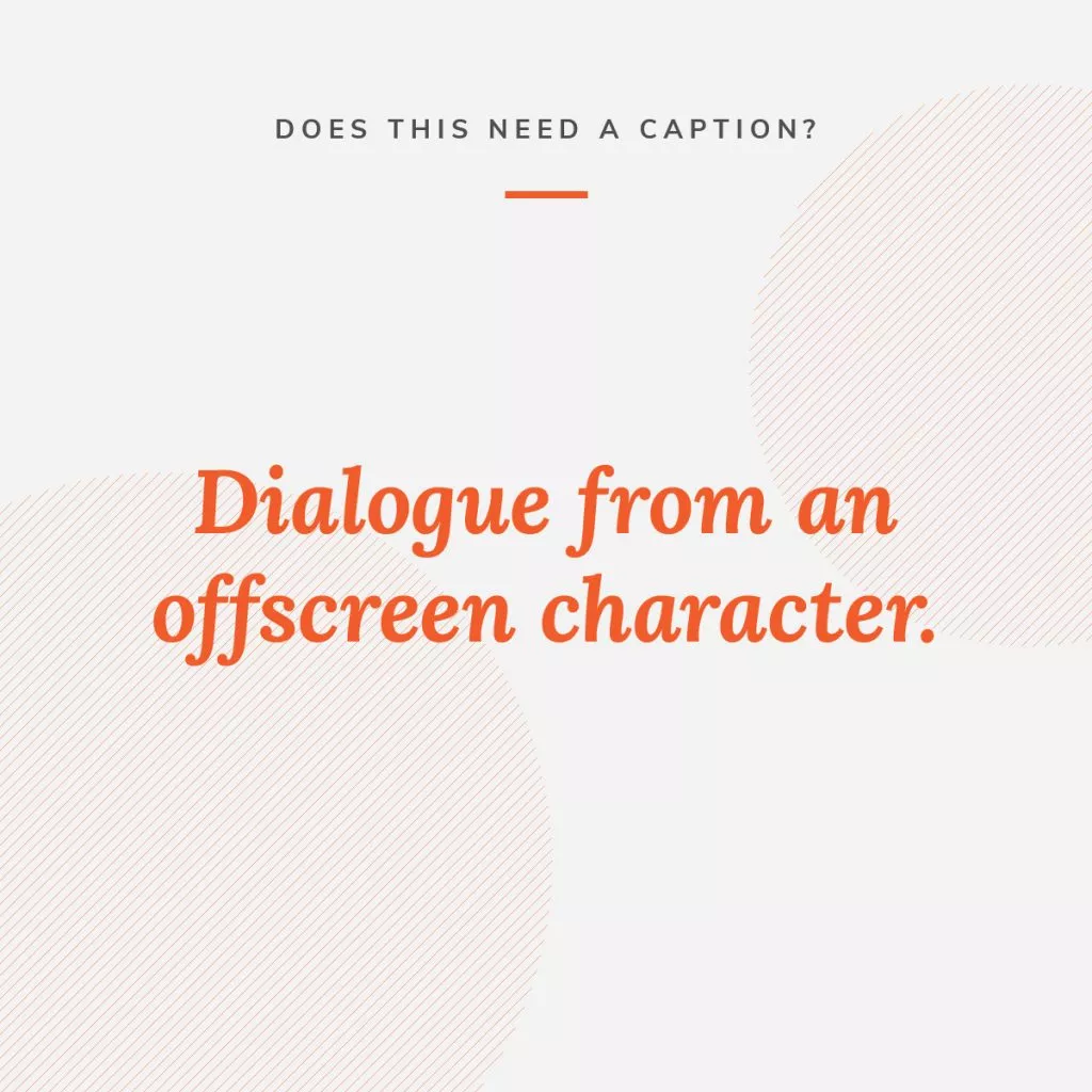
Our graphic designers challenged themselves to create beautiful, accessible graphics for social media – that are about accessibility. Check out their designs and explanations below.
Senior Graphic Designer Nicole Emenhiser:


Q: Tell us about what you created.
A: I created a “Does this need a caption?” social media post series that asks our audience to identify when certain video or motion-graphic scenarios require a caption. Especially in places like YouTube, more people are wanting to caption their videos. It’s a task that seems straightforward until you’re doing it. There are a lot of tiny details that could go one way or another. For instance, you have two actors in the background having a conversation. Your hearing audience can’t comprehend the conversation. It’s just background audio. But those who are deaf or hard of hearing don’t know that, and they may be distracted, wondering if they’re missing information that you failed to provide them. So what do you do? How do you indicate that? This is meant to be a simple series of posts that build your know-how muscles! We want to get you thinking about accessibility scenarios ahead of time, and we’ll share answers with you, along with rationale.
Q: What inspired you to create this design?
A: I follow a YouTuber named Jessica Kellgren-Fozard. Not only is she a gem (and Fashion Queen Extraordinaire), but she’s also very open about her experiences of living with disabilities. She works very hard to educate and inform people while always acknowledging that everyone’s situation is different. Her thoughtful approach has really helped me think differently. Plus she did a whole video on closed captioning, addressing some of these questions. It was very informative!
Q: Why is website accessibility important in design?
A: Because people are people, and everyone deserves to be treated as a person. It doesn’t matter if you’re a minority or a majority. You, individual person who lives and works hard and does your best every single day – even on days when you may not think so – deserve to be treated well. We’re not making an exception for you in a design; you should have always been considered from the start.
Q: How do you approach creating accessible designs?
A: By fumbling wildly and then relying on our accessibility wizards to please, please help me. That’s half joke and half not. I always do my best to start with accessibility in mind right out of the gate, but I definitely need a backup checker to make sure I’m on the right track!
Q: Anything else to add?
A: Follow more YouTubers with disabilities! There are so many people sharing their experiences with the world. And they’re working hard as heck to do so! So get out there, find and support those Youtubers, and learn a lil something while you’re at it.
Senior Graphic Designer Jess Gordon-Beach
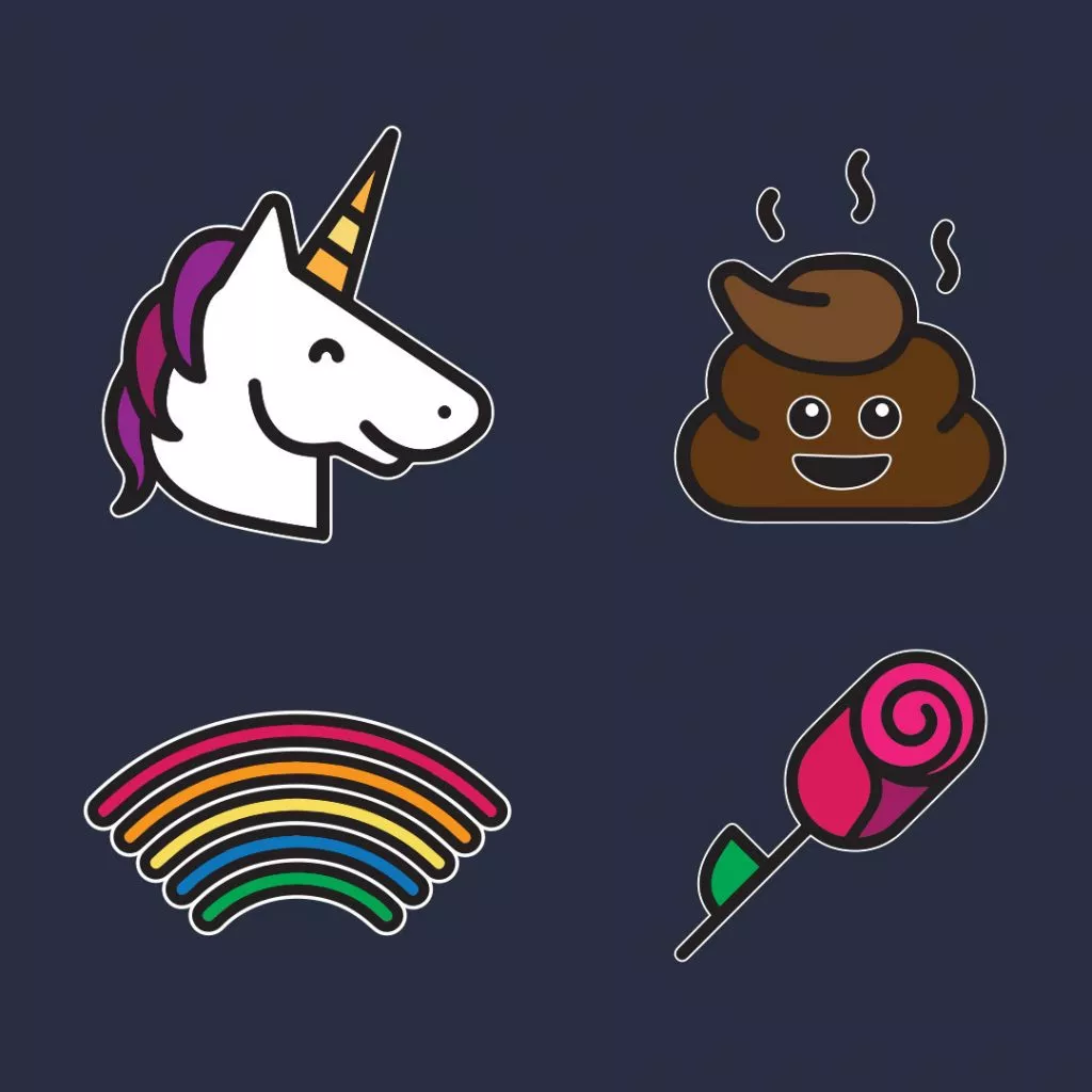
![Emoji description text for global accessibility awareness day: [unicorn] [pile of poo] [rainbow] [rose]](https://www.oneupweb.com/wp-content/uploads/2020/05/OUW_Accessibility_Emoji-text-1024x1024.jpg.webp)

Q: Tell us about what you created.
A: I created a two-panel social post, with the first showing what a screen reader or a phone with Voiceover will read when emojis are used, and the second showing the emojis. Emojis are given descriptions that work with most (if not all) screen reading functionality.
Q: What inspired you to create this design?
A: I wanted to give people who don’t have sight difficulties and/or don’t use screen readers a little taste of how a common visual is experienced by someone who does. That led to the idea of telling a little story through emoji, where the first view is the alt text or description for each emoji. The second panel is the same story but with the emojis.
Q: Why is website accessibility important in design?
A: Accessibility is important in all design because it creates a useful and (hopefully) pleasant experience for all users. Accessibility often creates a better experience for everyone, not just those who need specialized tools or functionality to aid them.
Q: How do you approach creating accessible designs?
A: One of the first things I do when starting a new design (I try to make all designs as accessible as possible, regardless of requirement) is work on the color palette. For me, making sure that all colors meet required contrast ratios is the first step to success, as they are applied to so many different elements of the project. So if I can start with colors that I know meet contrast ratios, it’s much easier to meet other accessibility requirements because I’ve already solved one factor. I have also been setting up multi-tiered color palettes. For example, if I want to use red, I often have three variants of that red in my palette. This helps ensure that my color contrasts work despite how I need to use them: on light and dark backgrounds, at different text sizes and for essential UX elements.
Senior Graphic Designer Laura Payne
Q: Tell us about what you created.
A: I created an animated version of a striking statistic to highlight the importance of accessibility and how many people are affected.
Q: What inspired you to create this design?
A: I, myself, was startled by this statistic when attending an accessibility training provided by our lead accessibility expert. So I wanted to take that number and create something that was very simple yet emphasized the point in an engaging way. The hands that call out the “1 in 4” figure add a human element and engage the viewer to follow along. Setting the design against black draws a stark contrast that is highly visible and further emphasizes the importance of what the design is communicating.
Q: Why is website accessibility important in design?
A: Because it affects so many people. If people don’t have access to information, how do you expect them to engage with your brand or make a purchase? By prioritizing web accessibility, you are expanding your audience, being inclusive, helping your own ROI and allowing your brand to be seen/heard by more people. It is a win-win.
Q: How do you approach creating accessible designs?
A: By keeping the most vital rules top-of-mind (color contrast, for example). I typically design as I would normally, doing checks and balances throughout. Then I send it through Oneupweb’s accessibility review process to ensure I have executed the design appropriately.
Q: Anything else to add?
A: Accessibility can be hard. There are a lot of rules, and it can sometimes alter choices you would otherwise make in your designs. But knowing that your work can be universally accessed makes it beyond worth it. Being able to design well with those “constraints” ultimately makes you a far better designer.
More Than Just Accessibility Chatter
Oneupweb specializes in website accessibility services. With research, thoughtfulness and detailed quality assurance, we make sure each website heads to the client WCAG AA compliant.
If you’re looking for more information about website accessibility, check out our accessibility resource archives.
If you’re looking for a partner to help you apply accessibility standards, reach out online or call us at (231) 922-9977.