Effective Landing Page Web Design
Welcome users to your site with the right information, layout, and functionality by tailoring your landing page perfectly. Digital marketers have relied on landing pages for decades to provide a streamlined and effective experience that drives any number of conversions, including form fills, transactions, or downloads. Creating an effective landing page is an art and a science; here’s what you need to know.
What Is a Landing Page?
Landing pages are standalone web pages created specifically for a marketing campaign. Visitors typically land on these pages after clicking on a paid ad or a link in an email. These pages differ from the evergreen pages on a website because they are designed to have only one focus or campaign goal. With that in mind, there are a few critical techniques for building an effective landing page.
How Long Does It Take to Design a Landing Page?
Your design time will vary based on how much content you need to write and the visuals you need to prepare. However, campaign landing pages are meant to be minimalist. If you spend as much time on your campaign landing page as you would on a normal website page, check in with yourself or your team. Are you adding too much to your page? Scale it back if necessary to avoid overwhelming users and losing the message. And remember, creating different versions of the same landing page and testing each version’s effectiveness should be a part of your strategy. More on that later!
How to Design a Great Landing Page
Tip #1: Have one goal.
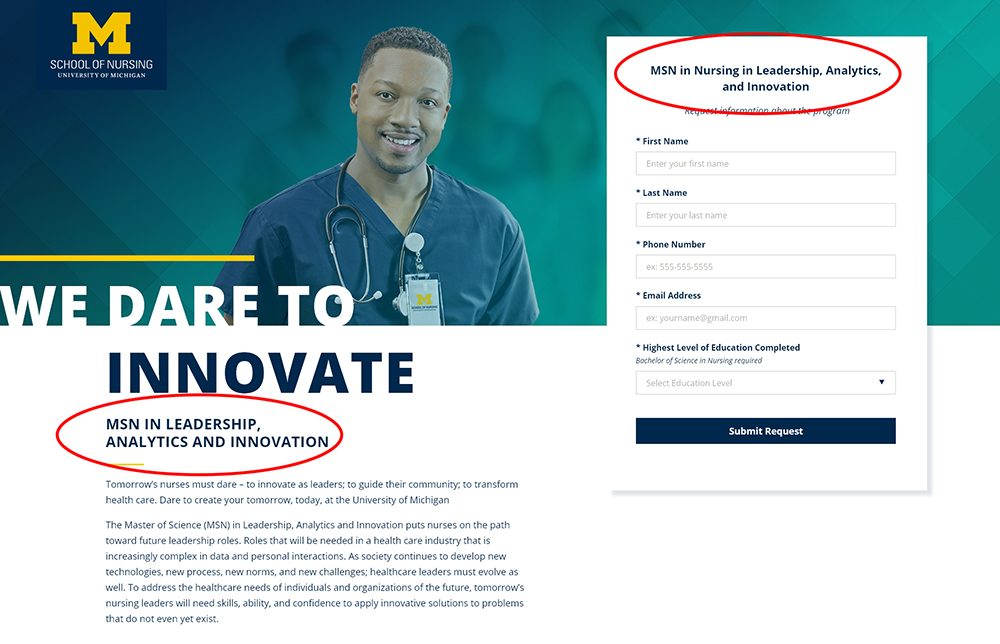
When a visitor lands on your landing page, they should only be presented the service or offering that enticed them to go there. This keeps visitors from getting distracted or confused. Make sure your messaging and design are focused on the action you’d like the user to take.

Tip #2: Remove distractions.
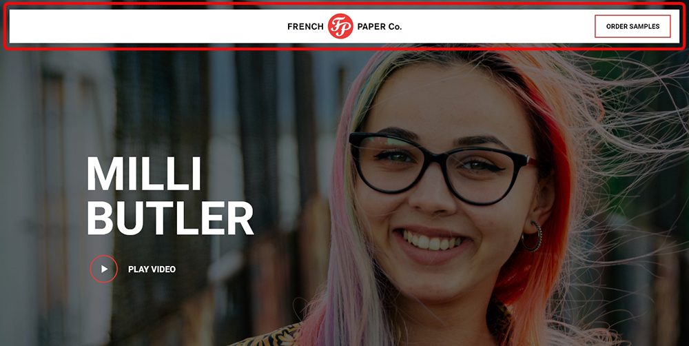
This ties back to the first tip. Remove any link or design element that would distract your visitor and take them away from your landing page.
While it depends on the campaign, we often recommend removing the following:
- Your website’s navigation
- Footer links
- Internal or external links in the copy
- Links to your social accounts

Tip #3: Simplify your form.
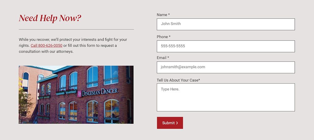
Most landing pages have a form to capture visitors’ information. Keep your form as short as possible while still capturing the information that you and your sales team need. For example, instead of having three form fields for city, state, and zip code, have the visitor just fill out their zip code.

Tip #4: Use visuals to guide your visitors through the page.
Landing page images and supporting visuals should show your product or service in action, direct attention to your main call-to-action (CTA) and aid understanding. Custom photography and videos are ideal if you want your landing page to make a strong impact.
Effective images include:
- Someone looking at your introductory content
- A stylized product photo that wraps around the CTA
- A product-explainer video or infographic
- An image conveying a pain point (specific frustration) that your product solves
- An image conveying the user’s end goal or aspiration
Obe’s website utilizes video at the top of this Google search landing page to engage users and explain their fitness experience.
Tip #5: Keep the design consistent with your brand.
When creating a landing page, use the same visual styles (colors, fonts, image styles, etc.) as your other digital properties. It’s likely that this visitor will engage with your brand again, and branding consistency creates trust. This doesn’t mean your design has to be boring – just brand-aligned!
Note: This same guideline applies to messaging. If you’re interested in more messaging tips, as well as development tips, check out our other resource about creating landing pages that convert.
Tip #6: Use a thank-you page.
After the visitor converts on your form, serve them a thank-you page. This your opportunity to tell your new prospect or customer what to expect next. Thank-you pages are also an excellent tool for improving marketing efficiency, as they give you a chance to keep the conversation going – e.g., through retargeting.
Things you should do on a thank-you page:
- Tell them “thank you!”
- Let the user know what the next steps are. If someone from your team is going to reach out to them, let them know who, how, and when.
- Link to helpful resources about your product or service.
- Include links to your social media properties.
- If your landing page and thank-you page are on a separate domain, link to your main website.
Tip #7: Test and optimize.
Testing your design and copy is essential for optimizing conversion rate. It may be tempting to stick with a landing page design that someone says is “best practice,” but this might not be the best solution for your audience. For example, you will see many articles that tell you to put your form at the top of your page. This is a good starting point, but testing may reveal that your visitors prefer that form to be at the end of the content.
Tip #8: Know what happens next.
You’ve captured the contact information of a qualified lead; now what? Use tools like Hubspot, Salesforce or Mailchimp to create an automated drip campaign that sends emails with more information and resources. Depending on your organization and sales process, you might want to ensure a sales representative can qualify the lead and get in touch personally.
Related: Evaluating and Choose A CRM
Get Better Results from Your Campaigns with Landing Page Design Services
One way to get superb results from your campaigns and landing pages is to hire experts. Oneupweb designers, developers, content writers and paid advertisers all work together to create effective digital marketing campaigns for diverse businesses. From providing landing page optimization services to ensuring your site follows landing page UX best practices, we can do it all. Reach out to see how we can help or call (231) 922-9977.