Forget the Fold. Embrace the Scroll.
Back in the olden days of the Internet—the mid 1990s—the average user did not know how to scroll down a web page to access additional content, but times have changed. Almost 20 years later, users are now extremely familiar with scrolling, so much so that in 2011, Apple removed the scrollbar from their operating system, showing that many users no longer even needed the visual cue.
 The old web design concept of placing massive amounts of content above the page fold, where users do not have to scroll, no longer has the relevance it did. In 2007, one study showed that at least 76% of website users scrolled and regardless of the page length, 22% scrolled all the way to the end.
Here, at the dawn of 2014, the percentage of people scrolling is likely much higher. The adoption of mobile devices with small content areas, touch screens, infinite loaders and a popular web design trend toward long, single-page websites has made scrolling the natural action for users to take.
But, in this marvelous world of scrolling pages there is a catch: users must have reason to scroll. There needs to be a hook to draw them deeper into the page. In our world of short attention spans, it is necessary to make users believe that the content they scroll for will be worth their time.
Most users will scroll, but the top of the page remains the most important real estate. It’s the user’s first impression, and the focus of up to 80% of their attention.
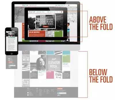
However, with the variety of screen sizes proliferating through the world, it is impossible to identify the location of the fold in the same way we used to. On a mobile phone measuring a meager 3 x 5 inches it is impossible to put any large amount of content above the fold. Contrast the small with the large 23-inch monitors of many desktop computers, and all the different sizes and shapes in between, and you find yourself with great convolution.
At the end of the day, the top of any given web page still matters the most, but the old everything above the fold idea has never been less meaningful.
Don’t obsess or jam the top of your page with too much and clutter it up. Let your users discover content. If they are interested, they will continue until they reach what they are looking for. Make sure that they know who you are, and what you do “above the fold”, and then trust that they will begin the great scrolling adventure through your website.