Yahoo! The Logo is Dead, Long Live the Logo
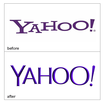
The new Yahoo! logo is here (below). And after 30 days of anticipation, gone are the jostled letters and oversized serifs of yesteryear.
In its place is a logo that seems intended to reflect the streamlined direction that Yahoo! and its related properties have been moving toward over the past year.
No matter what your opinion on the new logo is, it’s clear that with the redesign, Yahoo! bravely took a necessary step forward.
Stagnation on the Internet can be a death sentence. Without change, users can quickly lose interest and move on to the next big thing. But clear brand strategy that changes to meet user needs can keep a brand well-engaged on the modern web. Let us know what you think of the new Yahoo! logo.

