Short’s Brewing’s New Look: A Website Redesign Case Study
Short’s Brewing Company‘s meteoric rise from a small-town brewery to one of the Midwest’s most beloved craft breweries is the stuff of legend. The Elk Rapids, Mich. production facility and Short’s pub in Bellaire, Mich. have become must-see NoMi destinations for tourists and beer enthusiasts – not to mention economic engines for the communities they serve.

That also means that Short’s Brewing’s website is an important tool. The site is instrumental to reach customers locally and nationwide, generating revenue online and supporting in-store and on-premises sales on behalf of their valued distribution partners.
We couldn’t be prouder to be a part of the Short’s Brewing Company universe, and we were thrilled to build the best brewery website on the ‘net.
Brewery Websites: A Primer
There are good reasons for regional breweries like Short’s to invest in their website. In 2022, with 9,552 microbreweries, brewpubs and regional beer brands operating in the US, the number of craft breweries reached an all-time high.
However, the landscape is changing. As consumer tastes and priorities shift, total beer sales declined by 3.1% in 2022. More businesses jockeying for a smaller, shifting, or less thirsty customer base means that brands are experiencing more competition for tap handles, shelf space, and a place in that singles six-pack at the local party store.
A strong brewery website is key in supporting direct-to-consumer sales, on-premises sales, attracting visitors to a restaurant or brewery, and supporting retail sales through brand awareness. For a company with the regionally famous marketing chops of Short’s, a website redesign presented an opportunity to even further differentiate itself from competitors, improve the user experience, continue its brand evolution and keep diehard followers up to date.
The Challenge
Let’s call it growing pains. Short’s Brewing Company’s rapid growth and 2017 partnership with Lagunitas Brewing Company pushed the small-town organization to mature quickly. While production and operations kept pace, the brand’s digital brand and infrastructure were on the back burner.
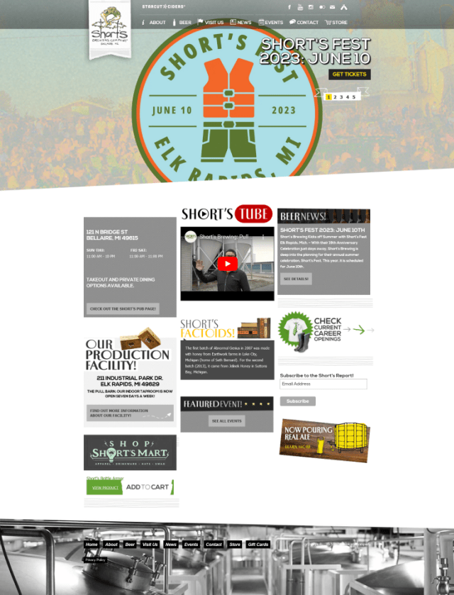
The old website was creaky. Short’s development team had done an admirable job keeping it working but were doing somersaults to keep it functioning properly with the ERP system. The dated technology was relatively slow and contributed to a less-than-ideal user experience.
The Solution
Short’s Brewing gave us the green light to go big – so we did! Our team quickly realized the biggest barrier facing users was a clear, intuitive path to the information, resources – and beer. We used user-flow data from the existing site and leaned on our content marketing and design teams to create a new-and-improved user journey for the most important conversions on the site.
Go With the Flow
The term “conversion” will mean different things for different brands. In this case, it was to make a purchase or plan a visit. We ensured that these items were as close to the users’ point of entrance to the site as possible – within just two to three clicks.
The research and reporting team dug into the existing Universal Analytics property to map out user flows and handed it over to the project team. We also identified important tidbits of information to include along the way, enriching the experience and arming users with everything they needed to know before finding themselves happily in a place to convert.
Oh, and It Had to Look Good
Short’s famously funny – and sometimes head-scratching – beer names are a testament to the brand’s near-legendary creativity. Just before our site project, Short’s began an intensive brand redesign. While we didn’t lead the branding effort, we worked close with Short’s so our work on the site fully aligned with the brand update.
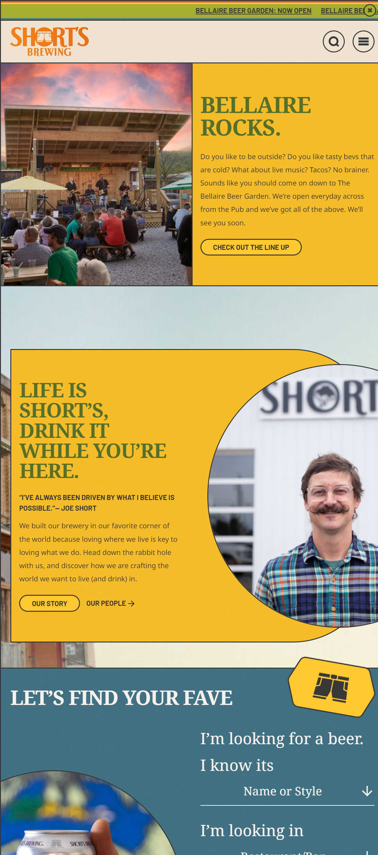
Our website design team “tapped” into the results of the brand redesign to create a look that combines the small-town charm and whimsical nature of the Short’s brand kit. Balancing form and function can be a hard line to walk, and we certainly benefitted from regular discussions and feedback from a thoroughly invested Short’s marketing team.
We also had some fun with it; working with the Short’s team, we introduced an “Easter Egg” for visitors to find. See if you can find it!

The Results
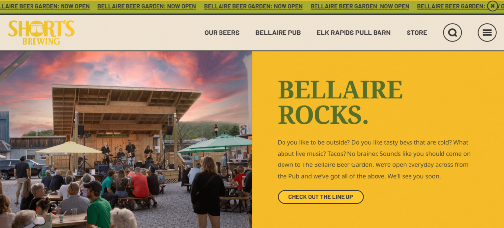
First off, the site looks exceptional. It brings the brand’s new look to life in a way that’s thoughtful and timeless. One of the key reasons Short’s tapped Oneupweb was our reputation for delivering stunning web designs that seamlessly weave the threads of brand, user, function and fun. Once again, our designers put together an aesthetic that, page for page, delivers a visual punch.

Like most brewery websites, it’s fun and friendly – but unlike many competitors, this thing works. Thanks to our development team, the website retool immediately impacted organic performance and user engagement while streamlining ERP processes behind the scenes. (Pop open our SEO Glossary as a cheat sheet if you need to!)
Organic Keyword Profile
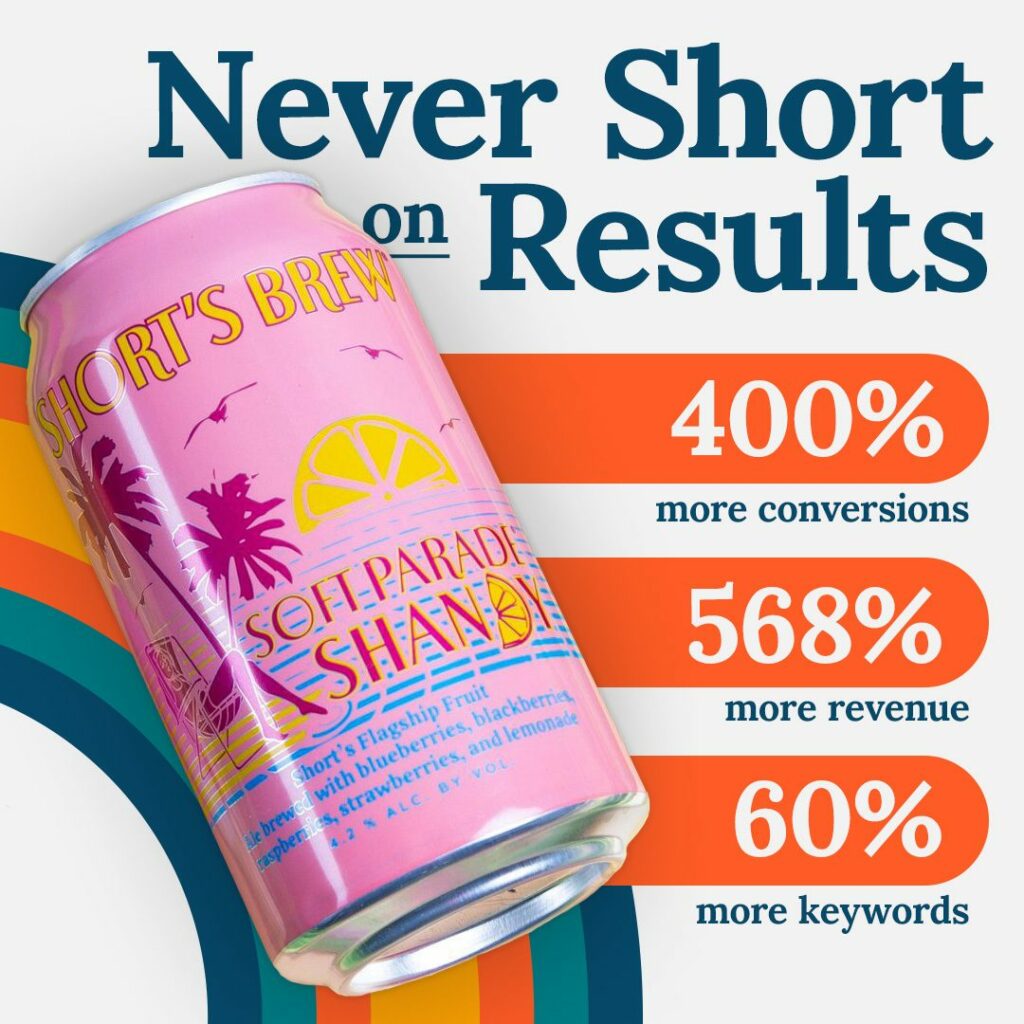
Comparing pre-launch to four months post-launch, Short’s holds organic keyword rank for 60.2% more keywords in the top 100 positions. Much of these improvements are attributable to improving Core Web Vitals, streamlining the site structure and ensuring technical SEO elements of the site were nothing short of perfect.
Organic Sessions
Comparing the first 45 days of the new site to the ensuing 45 days, the site made massive strides: organic sessions increased 34.85%, with organic users increasing 42.48%.
Organic Engagement
Quantity is nothing without quality. One of the reasons Short’s is the most beloved brewery in the Midwest is for its attention to the finer, even minute details of its products. It’s something our organizations have in common – we value quality over quantity.
The look and feel of the new site was one of our main priorities – designing an effective user flow formed the basis of much of our work. And work, it did!
Engaged organic sessions increased by 24.7% PoP, while the average engagement time per session increased by 5.0%.
Across all acquisition channels, the engagement rate declined by 5.3%, but compared to the 20.1% increase in total sessions, that isn’t surprising. There’s a correlation between these numbers: as volume increases, engagement tends to decrease as brands reach a wider, more top-of-funnel audience.
Conversions
The best measure of our user flow strategy is evaluating conversions. The total event count, or the total number of things users did on the site, increased by 21.4%. That contributed to a 400% increase in total conversions and a 568.1% increase in total revenue.
Key event improvements:
- Add to carts: +250.0%
- Begin checkouts: +184.3%
- Keg order form submits: +621.4%
Fun, Fast and Engaging – Just Like Short’s Brewing Company
It was our goal to build a set that can grow, evolve and support the brand through this next stage.
The new Short’s Brewing Company website is part playground, part data-driven digital resource, which is exactly what a brewery’s website needs to be.
The new design exemplifies the re-envisioned brand and supports the company across its various properties and networks.
Invest in Your Digital Footprint with Oneupweb
Our experienced team of developers, designers, strategists and writers can help you create the perfect website to stand out from the crowd. We’ve helped breweries and wineries fine-tune, build or completely reinvent their website and brand. See what more than 20 years of experience can do for your marketing efforts. Get in touch today or call 231-922-9977 today to get started.
The previous Short’s Brewing Company website

Our redesigned Short’s Brewing Company website
