Oneupweb Email Case Study
In July 2019, we ramped up our internal email marketing at Oneupweb, starting with launching the Digital Digest, a weekly newsletter. Through extensive testing, surveys and tweaks to the template design, we achieved an open rate of 24.78% and an average clickthrough rate of 25.41%. (Average open rate, depending on industry, is 15 – 25%.)
See how we pulled off strong engagement from our email strategy.
Scope of Work
Over one and a half years, we made numerous improvements to our weekly newsletter, including these:
- Email template design (via drag-and-drop editor in HubSpot)
- Weekly email copywriting and sending
- List growth strategy
- A/B testing
- Surveys
The Challenge
Launching a newsletter takes careful consideration. You want to craft every email so that it matters to your audience. It’s important to set the expectation that readers can look forward to receiving the emails consistently, and that they’ll get quality content each time.
We wanted to share our own original content – not just external articles – to be helpful and respond to specific audience needs. While we were already publishing our blogs and resources frequently, the newsletter added pressure to appropriately schedule and plan those posts.
Finally, we needed our existing and new content to help us organically grow our email list.
The Strategy
Email List Growth Strategy
When the newsletter first launched in mid-2019, it was sent to a list of less than 100 people (mostly our staff). At the end of 2020, our list size had grown 5x to 502. Growing a list and keeping your audience engaged is a delicate balance in email marketing.
Our Digital Digest list growth strategy included these tactics:
- We auto-enrolled anyone who filled out a form on our website to receive emails. We used a CAN-SPAM compliant checkbox, of course.
- We used social media to encourage signups to the Digital Digest.
- We created nicely designed CTAs – both simple “enter your email” forms and button CTAs. We placed them on the blog footer and scattered throughout our website.
- We began creating more partially gated content – such as downloadable marketing guides and templates behind a simple email form. These are housed in blogs and articles with high SEO value, allowing us to organically attract people to our newsletter while still providing value if they decide not to opt in.
A/B Testing Email Design
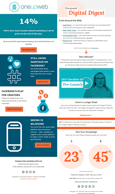
They say a picture is worth a thousand words, so we’ll let this before-and-after shot of our newsletter do the talking:

Here are some of the things we tested to improve our email layout and content:
- Use of video thumbnail or GIF to increase clicks
- Send times
- Send days
- Number of links to include to increase clicks
- Link button style to increase clicks
- Subject line voice, tone, length and style
Regular A/B testing in email marketing helps you keep your content fresh by creating new ways to deliver an experience. Continually optimize your emails for what keeps your readers happiest, and you’ll be happy with the results!
Surveys
To give our readers the best experience possible, we created a survey to (1) gauge opinions of the newsletter and (2) understand what else they’d like from the email.
We asked questions like:
- On what day would you like to receive the email?
- What type of content would you like to see?
- How would you rate the quality of information?
The Results
We ended up with what we believe is a superior newsletter for marketers. The following performance improvements show how far we’ve come:
- Average CTR increased from 9.49% to 13.48% YoY. (August 2019 vs. August 2020)
- Average number of opens, per send, increased from 15 to 112 YoY. (August 2019 vs. August 2020)
- List size grew from 94 to 502. (July 2019 vs. December 2020)
Looking for ways to improve your email marketing strategy or launch a newsletter of your own? View our email marketing services.