Client Snapshot: Website Design Refresh for HARMAN International
Audiophiles know HARMAN International as the manufacturer and distributor of the industry’s best speakers and sound systems. With a catalog of sub-brands and truly global reach, HARMAN International’s website serves as a vital central touchpoint for customers, suppliers, distribution partners and employees across the globe.
When their marketing team reached out to us for tips to improve its corporate website structure, it was music to our ears.

The Oneupweb + HARMAN Connection
We’ve enjoyed a long relationship with HARMAN, completing several projects to support their internal marketing team. Working with HARMAN played a key role in our most recent challenge; improving the user experience, technical structure and SEO performance of HARMAN’s corporate website.
We mobilized our designers, developers and strategists to help.
HARMAN’s Website Problem
HARMAN International is a big company. HARMAN itself is a subsidiary of Samsung, which acquired the iconic brand in 2017. At the time of acquisition, the HARMAN portfolio included household names like JBL, Mark Levinson and HARMAN Kardon, just to name a few.
It can be difficult for a company of that size and scale to seamlessly represent itself and its sub-brands to its multiple audiences in numerous countries.
HARMAN came to us because it needed to balance the positioning of its consumer and industry-facing brands with important information surrounding its capabilities, research and development and its role in several specific technology markets. Its website is the go-to source of information about corporate news and commitments, while also serving as a vital referral source to supports it catalog of brands.
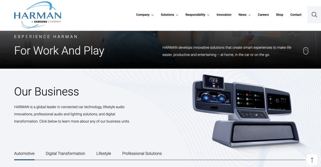
Aside from a more intuitive structure, the domain needed an updated visual aesthetic; the existing design felt slightly dated and perhaps underwhelmed new users.
Our Strategy
We tagged in OUW graphic designer Nicole Gravenhiser to bring a fresh eye to the existing site. The primary hurdle? A lack of direction. The existing site design left users unsure of where to go next. Without substantially changing the existing main navigation, Nicole experimented with several ways to pull users to the most valuable site resources.
This included introducing a fluid hero video that succinctly summarized HARMAN’s many capabilities; introducing audio, automotive and other technologies in just a few seconds. We also introduced neatly organized accordion content to help users access the content most relevant to their specific needs.
Other International Website Design Considerations
While Nicole handled the front end, our SEO and development teams went under the hood to optimize web page metadata and make substantive technical improvements to better meet the needs of an international website.
As a collaborative marketing agency, we worked hand-in-hand with HARMAN’s internal development team to research, write and implement optimized page titles and meta descriptions. We also identified up to a dozen valuable keywords for each of the site’s core pages. These previously undiscovered keywords served to improve both the SEO value of these pages and establish user expectations about the page content.
Meeting Accessibility Requirements
Our design and development teams also prioritized meeting and exceeding international accessibility standards. The HARMAN brand operates in more than two dozen countries and works with contractors and suppliers across the globe. As a part of our quality control process, we tested each of the pages we redesigned to ensure it received a 100% Google Page Insights accessibility score.
The Results
Our web design work for HARMAN was a perfect case study in how layout and formatting affect user behavior. In the six months after the site redesign, user engagement improved – a lot.
Here’s how sitewide engagement fared compared to the same 6-month period the previous year:
- Pages per session: +22.38%
- Average session duration: +111.57%
Bring It Home(Page)
Our homepage redesign delivered exceptional results: The homepage accounted for 35.4% of all landing page sessions during our six-month post-launch period, a marked increase over the same period during the previous year. The redesign also improved important user engagement KPIs.
Homepage landing page engagement over 6 months vs. the previous year:
- Page per session: +47.98%
- Average session duration: +272.61%
A Better Experience for Everyone
We’re proud of our partnership with one of the world’s most innovative companies. Working with HARMAN is a reminder that a commitment to quality breeds unparalleled success. That emphasis on purpose, intent and quality sets brands like HARMAN, and Oneupweb, apart. Experience what a professional and collaborative approach to marketing can do for your business. Contact Oneupweb or call (231) 922-9977 today to get started.

