Resources

The Beauty of a Graphic Design Retainer
Marketing teams want champagne-quality design assets on a fizzy beer budget – and they need it delivered on time. In-house marketing departments struggling to meet constantly evolving internal demands and goals need a hand. It’s smart to outsource the most specialized skillset first – and that’s why you need a graphic design retainer. The 5…

How to Create a Brand Voice Strategy That Works
Effective branding combines visual and emotional elements to create an immediate and lasting bond with the audience. Brand voices speak to past, current, and prospective users in a unique way that improves brand loyalty, invites new customers, and eventually becomes an intrinsic part of the brand’s identity. Creating a brand voice and tone is a…

Your Guide to Brand Workshops
Your brand is your organization’s most valuable asset. It sets you apart from your competitors and shapes how customers perceive you. Surprisingly, many businesses don’t clearly understand their brand, why it matters or how it impacts the bottom line. So, What Is a Brand Workshop? A brand workshop is a facilitated session in which stakeholders…

Why Brands Need a Style Guide
Style guides, also known as brand guides, manuals or the very comprehensive “brand and style guide” are an important marketing tool for organizations of any size. That’s because they document, organize and communicate a brand’s standards for logos, fonts and all the elements that represent your brand, including the voice and tone of written copy….

Collaboration in Figma: Our Favorite Ideation Tool
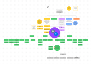
Figma is our go-to tool for internal collaboration, brainstorming and bringing many of those ideas to life. With companies comprised of distributed team members across the country and with clients located around the globe, Figma brings exciting whiteboard sessions into the digital age. Using Figma is a fun, intuitive and accessible way to connect people…

Short’s Brewing’s New Look: A Website Redesign Case Study
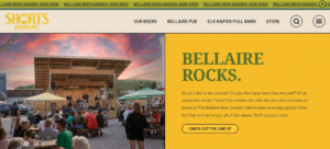
Short’s Brewing Company‘s meteoric rise from a small-town brewery to one of the Midwest’s most beloved craft breweries is the stuff of legend. The Elk Rapids, Mich. production facility and Short’s pub in Bellaire, Mich. have become must-see NoMi destinations for tourists and beer enthusiasts – not to mention economic engines for the communities they…

Why You Should Outsource Graphic Design Services and Other FAQs
Few small and medium-sized companies have professional graphic designers on staff. Even if someone from the marketing department has opened Photoshop a time or two, you’ll get better quality results when you outsource design work to an experienced digital agency. We’ll run through some graphic design FAQs that will show you why it’s better to tag…

3 Ways You Can Use Animated GIFs in Digital Marketing
While there may be controversy about how to pronounce it, there’s no debate: GIFs kickstarted the shift to short-form video on social media. Before short-form video platforms like Vine hit app stores in 2012 and long before TikTok went global in 2016, GIFs were the most common short video. From Twitter to Tumblr, GIFs were…

Web Form Design Best Practices
Poorly designed forms ruin the customer experience and negatively impact conversions.What makes an ineffective form and why are they frequently a barrier for users? What can you, the site owner, do to design better forms? We’ve got a few ideas. 5 UX Best Practices for Forms Effective form design isn’t necessarily hard, but it does…

Tilley Distribution’s Merger & Acquisition Rebranding
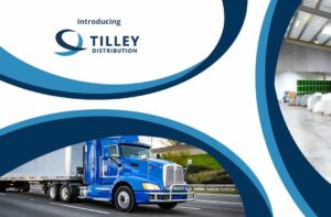
If you aren’t moving forward, you’re moving backward. In the wake of record-breaking M&A activity, brands are looking for ways to integrate diverse teams and create a new identity. Merger & acquisition rebranding demands introspection, deliberation and collaboration. Oneupweb has helped several clients navigate rebrands before, but our work with Tilley Distribution illustrates how to…

5 Simple & Powerful Website Animation Examples
Subtle website animation is an effective tool for capturing attention and directing users to the content or actions you’re hoping they will take. Animation leads the eye, improves user behavior and drives engagement metrics that can keep customers on site longer and drive them to the content they’re looking for. The Internet is a big…

Effective Landing Page Web Design
Welcome users to your site with the right information, layout, and functionality by tailoring your landing page perfectly. Digital marketers have relied on landing pages for decades to provide a streamlined and effective experience that drives any number of conversions, including form fills, transactions, or downloads. Creating an effective landing page is an art and…


